

Price Action Trading
This is a complete, beginner-friendly course on price action trading. Price action means reading the raw price on a chart, the candles, the highs, the lows, without needing any extra tools. We will go slow. We will use pictures for almost every idea, so you can actually see what we are talking about, not just read about it.
This is a course, not a short article, so we do not rush. It covers everything from the very first idea (what is a candle) all the way to advanced ideas like demand zones, liquidity grabs, and measuring price targets. Bookmark this page. It is written to be a reference you come back to again and again, not a one-time read. Each step builds on the one before it, so if you are brand new, start from Step 1 and move down in order.
A free course by Samir Dash, founder of Mindful Trading Hub.
What You Will Learn
- Step 1: What Is Price Action Trading, in Plain Words
- Step 2: Why Traders Read Price Action Instead of Just Indicators
- Step 3: Words You Must Know Before Going Further
- Step 4: Chart Types, Line, Bar, and Candlestick
- Step 5: Anatomy of a Candle, the Building Block of Every Chart
- Step 6: Candlestick Patterns, Part 1, the Essential Six
- Step 7: Candlestick Patterns, Part 2, Six More Worth Knowing
- Step 8: Why the Same Pattern Can Mean Different Things
- Step 9: Support and Resistance, and How a Broken Level Flips Sides
- Step 10: How to Draw Support, Resistance, and Trendlines the Right Way
- Step 11: Demand and Supply Zones
- Step 12: Market Structure, Spotting an Uptrend
- Step 13: Market Structure, Spotting a Downtrend
- Step 14: Trend Channels
- Step 15: Range-Bound Markets, When Price Goes Sideways
- Step 16: Liquidity and Stop Hunts
- Step 17: Reversal Patterns, the Head and Shoulders
- Step 18: Reversal Patterns, Double Top and Double Bottom
- Step 19: Continuation Patterns, Triangles, Flags, and Wedges
- Step 20: Measuring Price Targets From Patterns
- Step 21: Gaps, What They Are and Why They Matter
- Step 22: Breakouts, Fakeouts, and How to Tell Them Apart
- Step 23: Volume, the Price Action Trader’s Confirmation Tool
- Step 24: Fibonacci Retracement as a Price Action Tool
- Step 25: Using a Moving Average Alongside Price Action
- Step 26: Multiple Timeframe Analysis, Zoom Out Before You Zoom In
- Step 27: Price Action Entry Approaches
- Step 28: Setting Profit Targets and Managing an Open Trade
- Step 29: Stop Loss and Position Sizing, With the Real Math
- Step 30: Keeping a Trading Journal and How to Practice
- Step 31: The Biggest Mistakes Beginners Make
- Step 32: A Simple Checklist Before You Trade
- Step 33: Quick Glossary, Every Term in One Place
- Step 34: What to Do Next
- Frequently Asked Questions
Step 1: What Is Price Action Trading, in Plain Words
Picture a cricket match. You could watch the live game and see every ball, every shot, every run. Or you could just check a scoreboard app that updates every few minutes and tells you the score went up. Both tell you something happened. But watching the live game shows you exactly how it happened.
Price action trading is like watching the live game. It means looking directly at the price on a chart, how it moves up, how it moves down, where it pauses, where it turns around. You are not waiting for a separate tool to tell you the score changed. You are watching the actual game as it happens.
A price chart is simply a picture of buyers and sellers fighting it out over time. When buyers are stronger, the price goes up. When sellers are stronger, the price goes down. Price action trading is the skill of reading that fight directly from the chart.
Step 2: Why Traders Read Price Action Instead of Just Indicators
An indicator is a tool built using old price data, like a formula that looks backward and gives you a number or a line. Indicators are not bad. But they always come a little late, because they are built from price that already happened.
Price action comes first. An indicator is calculated from price. Price is never calculated from an indicator. So a price action trader learns to read the original source, instead of only reading a delayed summary of it.
Think of it like reading a news report versus being at the event yourself. A report is useful and can still be accurate. But it is always built after the fact, from what already happened. Being there yourself means you see things the moment they happen, with nothing standing in between.
Many experienced traders use both price action and a few simple indicators together. This course focuses mainly on price action, because it is the skill that works on every chart, in every market, at every time, and costs nothing to learn. Later, Step 25 will show you how a moving average, one of the simplest indicators, is often used alongside price action rather than instead of it.
Step 3: Words You Must Know Before Going Further
Here are a few simple words that will come up again and again. Read them once. You do not need to memorize them, just come back here any time a word feels new.
- Candle: A small picture on the chart that shows how price moved during one fixed period of time, like one day or one hour.
- Bullish: Price is expected to go up, or has been going up. Usually shown in green.
- Bearish: Price is expected to go down, or has been going down. Usually shown in red.
- Trend: The general direction price has been moving in, up, down, or sideways.
- Support: A price level where falling price has stopped and bounced back up before.
- Resistance: A price level where rising price has stopped and turned back down before.
- Breakout: When price moves firmly past a support or resistance level, instead of bouncing off it.
- Timeframe: How much time one single candle on the chart represents, such as 1 minute, 1 hour, or 1 day.
Step 4: Chart Types, Line, Bar, and Candlestick
Before we zoom into a single candle, it helps to see the bigger picture. The exact same price data can be drawn on a chart in more than one way. Here are the three you will see most often.
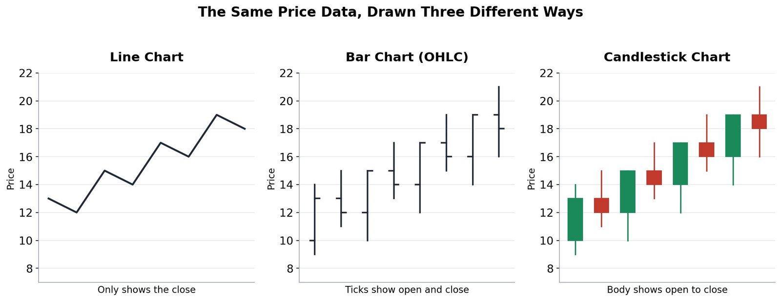
A line chart simply connects the closing prices with a line. It is the simplest to read, but it hides everything else that happened during each period, the open, the high, and the low.
A bar chart shows a small vertical line for each period’s full high to low range, with a short tick on the left for the open and a short tick on the right for the close. It holds the same information as a candle, just drawn differently.
A candlestick chart shows the same four numbers as a bar chart, open, high, low, and close, but with a thick body that makes it instantly visible whether price went up or down during that period. This is why almost every price action trader uses candlestick charts. The rest of this course builds entirely on reading candles.
Step 5: Anatomy of a Candle, the Building Block of Every Chart
Every candlestick chart you will ever look at is simply made of many candles, placed one after another. So before anything else, you need to know what one single candle is actually showing you.
Each candle tells you four numbers for its time period: the price when it opened, the highest price it reached, the lowest price it reached, and the price when it closed.
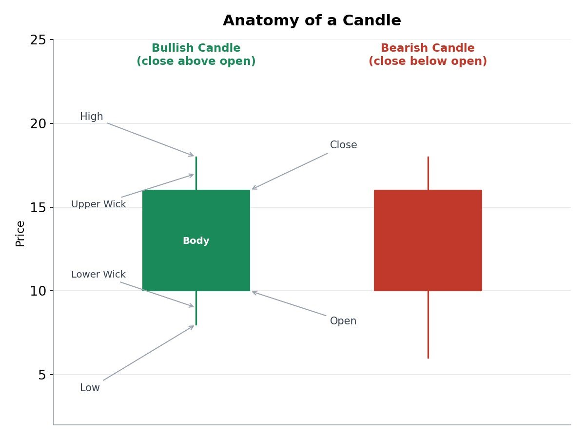
The thick part is called the body. It shows the gap between the open and the close. The thin lines above and below the body are called wicks, sometimes also called shadows. They show the highest and lowest price touched during that time, even if price did not stay there.
If the close is above the open, the candle is bullish, usually shown in green. If the close is below the open, the candle is bearish, usually shown in red. That is the whole idea. Once you can read a single candle, you can start reading a full chart.
Step 6: Candlestick Patterns, Part 1, the Essential Six
A candlestick pattern is simply one candle, or a small group of candles, that tends to repeat and carries a common meaning. Here are six of the most useful ones for a beginner to recognize on sight.
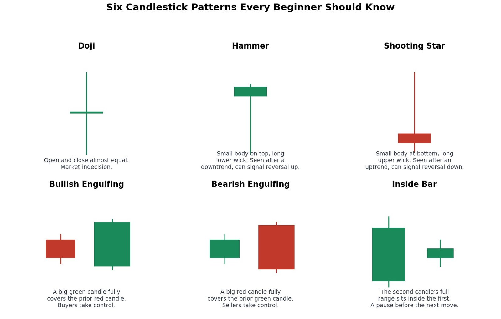
- Doji: The open and close are almost the same price, so the body looks like a thin line or a plus sign. It shows that buyers and sellers are evenly matched, neither side won that round.
- Hammer: A small body sitting near the top, with a long lower wick. It often shows up after a fall, and can mean sellers pushed price down but buyers pushed it back up strongly before the candle closed.
- Shooting Star: A small body sitting near the bottom, with a long upper wick. It is the mirror image of a hammer, often shows up after a rise, and can mean buyers pushed price up but sellers pushed it back down.
- Bullish Engulfing: A red candle followed by a bigger green candle that completely covers the red one. It can mean buyers have firmly taken over.
- Bearish Engulfing: A green candle followed by a bigger red candle that completely covers the green one. It can mean sellers have firmly taken over.
- Inside Bar: A candle whose full range sits completely inside the range of the candle before it. It often shows the market is pausing and catching its breath before the next move.
No single candle pattern is ever a guarantee. Think of each one as a clue, not a promise. The real skill is in combining this clue with the other ideas in this course, like where it happens on the chart, which Step 8 explains directly.
Step 7: Candlestick Patterns, Part 2, Six More Worth Knowing
Once the essential six feel familiar, here are six more patterns that show up often enough to be worth learning by name and shape.
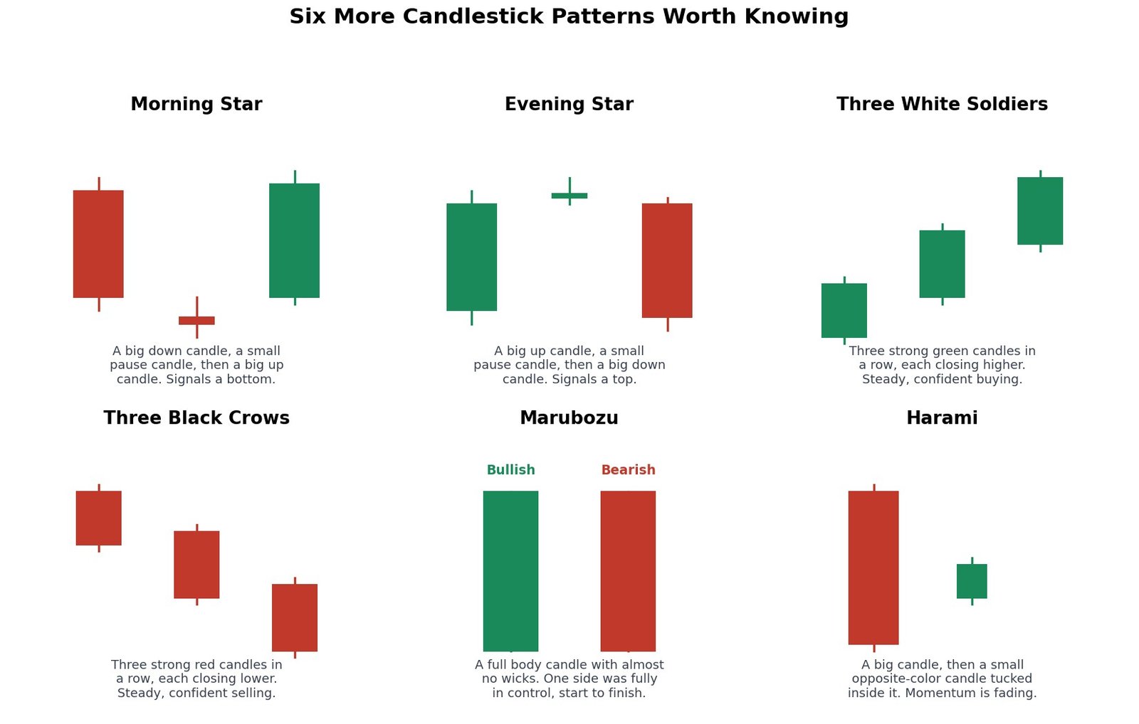
- Morning Star: A big down candle, then a small pause candle, then a big up candle. A three candle pattern that can signal a bottom forming.
- Evening Star: The mirror image, a big up candle, a small pause candle, then a big down candle. Can signal a top forming.
- Three White Soldiers: Three strong green candles in a row, each closing higher than the last, with small wicks. Shows steady, confident buying.
- Three Black Crows: Three strong red candles in a row, each closing lower than the last. Shows steady, confident selling.
- Marubozu: A candle with a full body and almost no wicks at all. It means one side, buyers or sellers, was fully in control from the opening bell to the close.
- Harami: A big candle followed by a small, opposite colored candle tucked completely inside its body. It can signal that the strong momentum of the first candle is fading.
A few more names worth recognizing, even without a separate picture for each: a Piercing Line is a bullish two candle pattern where a green candle closes back above the midpoint of the prior red candle’s body. A Dark Cloud Cover is its bearish mirror image. A Tweezer Top is two candles sharing almost the exact same high, and a Tweezer Bottom is two candles sharing almost the exact same low, both suggesting a level is being firmly rejected.
Step 8: Why the Same Pattern Can Mean Different Things
Here is a lesson many beginners learn the hard way. The exact same candlestick pattern can mean completely different things depending on where it shows up on the chart.
A hammer appearing after a long fall, right at a support level you already know about, is a meaningful clue. A hammer appearing in the middle of a quiet, flat, sideways stretch of price, with no clear support nearby, is far less meaningful, it might just be noise.
Think of a pattern like a single word in a sentence. The word by itself has some meaning. But the same word can mean something very different depending on the sentence around it. A price action trader never reads a candle pattern alone. They always ask: where is this happening? At a tested support or resistance level? Inside a trend? Inside a range? The location is often more important than the pattern itself.
This is exactly why this course builds patterns on top of structure, and not the other way around. By the time you reach Step 17 and beyond, you will already know how to read support, resistance, zones, and trend, so the patterns from Steps 6 and 7 will mean far more than they would on their own.
Step 9: Support and Resistance, and How a Broken Level Flips Sides
Imagine a ball bouncing inside a box, hitting the floor and the ceiling again and again. Support is like the floor, a price level where buyers have stepped in before and pushed price back up. Resistance is like the ceiling, a price level where sellers have stepped in before and pushed price back down.
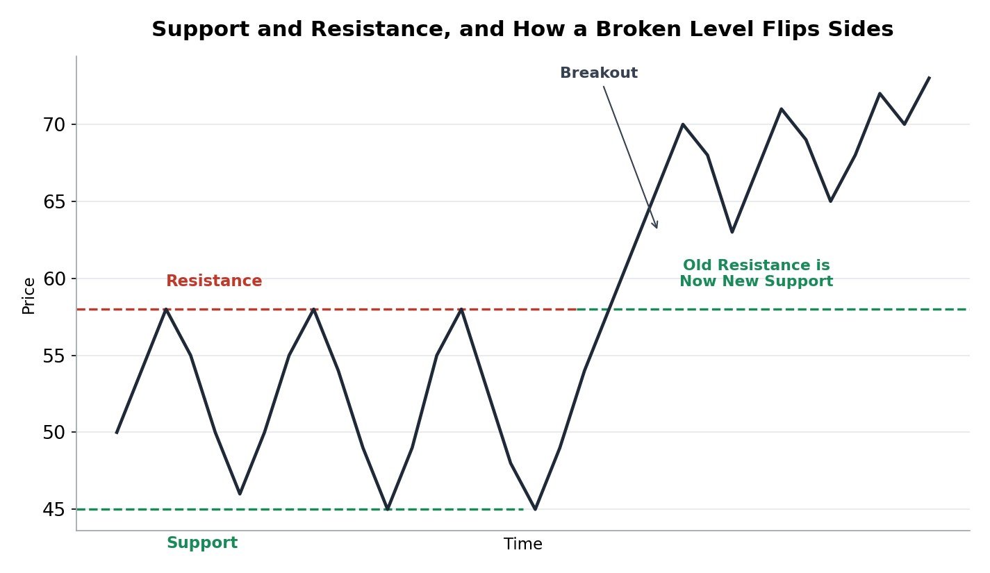
These levels exist because real people remember prices. If many buyers bought Stock A at Rs 45 and are happy with that price, they are often willing to buy more if it falls back there, which creates support. If many traders got stuck holding Stock A at Rs 58 and are waiting to finally sell at breakeven, that creates resistance.
Here is the part that surprises most beginners. Once resistance is broken with a strong move through it, that same level very often flips and becomes support going forward, as the picture above shows. The same logic works in reverse too. Once support is broken, it very often becomes resistance afterward. Traders call this role reversal, and watching for it is one of the simplest, most repeatable ideas in all of price action trading.
Step 10: How to Draw Support, Resistance, and Trendlines the Right Way
Knowing what support and resistance mean is only half the skill. Drawing them accurately on a real chart is the other half, and it trips up a lot of beginners. Here are a few practical habits that help.
- Use a zone, not a single hairline. Price rarely reverses at the exact same price every single time. Draw support and resistance as a small band or zone, not one perfectly thin line, and you will stop feeling like the market is “just missing” your line by a tiny bit.
- Decide whether you care about wicks or closes, and stay consistent. Some traders draw levels using the candle bodies (closes), others using the full wicks (highs and lows). Either approach is fine, but switching back and forth randomly will make your levels unreliable.
- Look for at least two touches before trusting a level. A single touch is barely a level at all, it could be random. Two or more clear touches at roughly the same price is what starts to make a level meaningful.
- Older levels are not automatically weaker. A well respected level from months ago can still matter today. What matters more is how clearly and how often price has reacted there, not simply how recent it is.
- A trendline needs at least two points to draw, and a third point to confirm it. The first two points only let you draw the line. It is the third time price respects that same line that gives you real confidence it is being watched by other traders too.
Step 11: Demand and Supply Zones
Support and resistance, as covered in Step 9, are usually drawn as simple lines. Demand and supply zones are a closely related idea, but drawn as a wider price area, or zone, instead of one line, and tied specifically to where a strong move began.
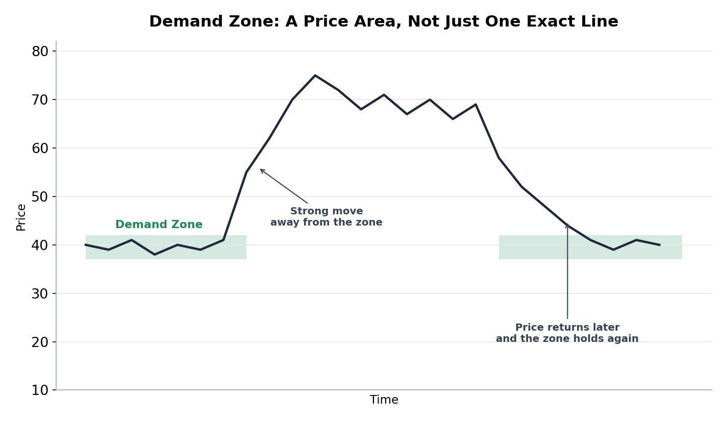
A demand zone is a price area where buyers were clearly strong enough to launch a sharp move upward. A supply zone is the mirror image, a price area where sellers were strong enough to launch a sharp move downward. The logic is simple: if a zone was strong enough to cause a big move once, there is a reasonable chance real buying or selling interest still remembers that price area if price returns to it.
Traders often describe a zone as “fresh” if price has not returned to test it yet since the original strong move, and “tested” after price has already come back and reacted there once or more. Many traders consider a fresh zone more reliable, since it has not yet absorbed any of the original buying or selling interest that created it.
The practical difference from Step 9’s support and resistance: a zone asks “where did the big move actually begin,” while a simple support or resistance line asks “where has price bounced before.” In real charts, the two ideas usually overlap quite a lot, and many traders use both together without worrying too much about the small difference between them.
Step 12: Market Structure, Spotting an Uptrend
Once you can see support and resistance, the next step is learning to read the bigger shape of the market, called structure. An uptrend has one simple, repeatable shape.
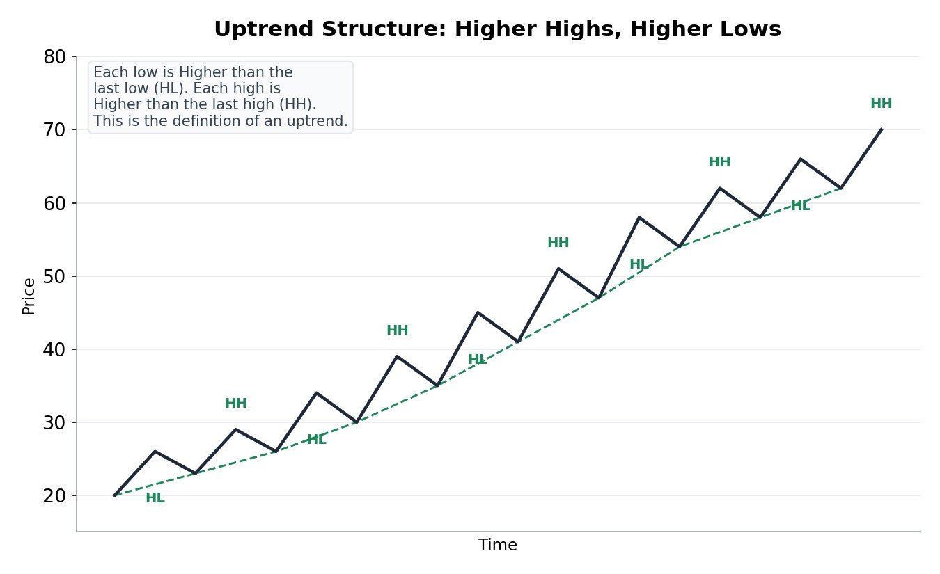
In an uptrend, each new high is higher than the high before it, and each new low is higher than the low before it. Traders shorten this to Higher Highs and Higher Lows, often written as HH and HL. As long as this pattern keeps repeating, the uptrend is considered healthy.
You can also draw a simple trendline by connecting the higher lows with a straight line, as shown in the picture. This line often acts like a moving support level. While price keeps respecting that line, the uptrend is still considered intact.
Step 13: Market Structure, Spotting a Downtrend
A downtrend is simply the mirror image of an uptrend, with the exact same logic flipped upside down.
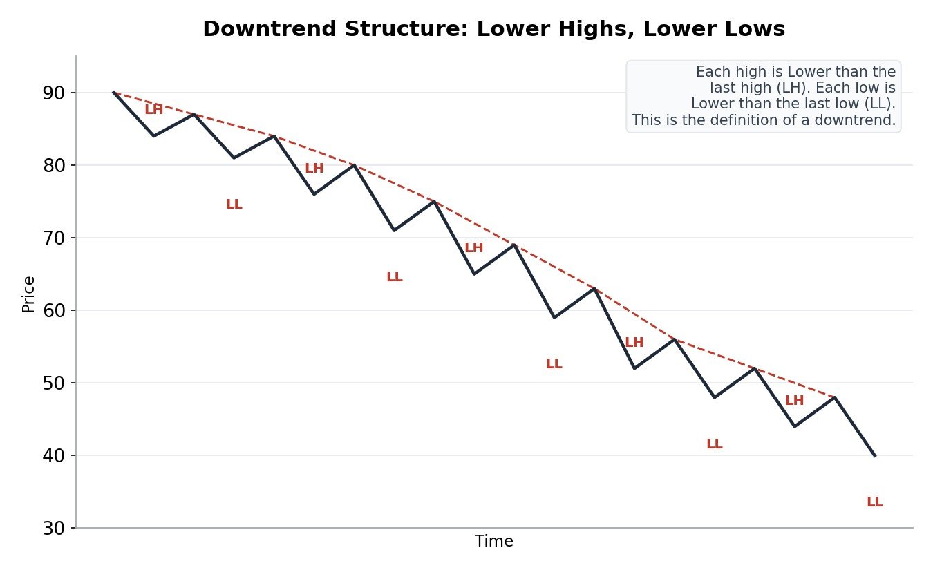
In a downtrend, each new high is lower than the high before it, and each new low is lower than the low before it. Traders shorten this to Lower Highs and Lower Lows, written as LH and LL. A trendline drawn along the lower highs often acts like a moving resistance level, capping each bounce.
The single most useful skill in all of price action trading is simply being able to look at a chart and say, calmly, “this is making higher highs and higher lows” or “this is making lower highs and lower lows.” Everything else in this course builds on top of that one judgment.
Step 14: Trend Channels
Once a trend is confirmed using the ideas in Steps 12 and 13, price often continues to move inside a fairly predictable path called a channel, bounded by two parallel lines instead of just one trendline.
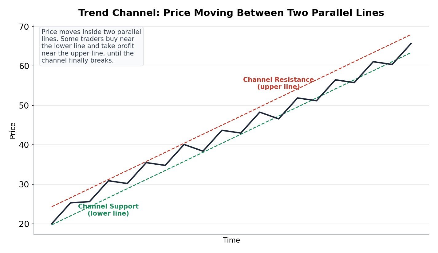
To draw a channel, first draw the trendline from Step 12 or Step 13 along the main swing points. Then draw a second line, parallel to the first, touching the opposite swing points (the highs, in an uptrend). Together, these two lines form a channel.
Some traders use a channel to plan trades inside an established trend, buying nearer to the lower line and considering profit booking nearer to the upper line, in an uptrend channel. A clean break out of the channel, in either direction, is often treated as an early signal that the character of the trend may be changing.
Step 15: Range-Bound Markets, When Price Goes Sideways
Not every market is trending. A huge amount of the time, price simply moves sideways, bouncing between a support level below and a resistance level above, without making any real higher highs or lower lows. Traders call this a range, or a sideways market.
A range is not a mistake or a boring accident. It is a completely normal state, often a pause while buyers and sellers decide who will take control next. Many traders specifically wait for a range to end, and watch closely for the eventual breakout, rather than trying to guess the next move while price is still stuck sideways.
The simplest way to recognize a range is to notice when price keeps touching roughly the same support and the same resistance two or more times, without pushing cleanly through either one, exactly like the first half of the support and resistance picture in Step 9.
Step 16: Liquidity and Stop Hunts
This idea explains something that confuses almost every beginner at some point: why does price sometimes spike just beyond an obvious level, trap a lot of traders, and then reverse hard in the other direction?
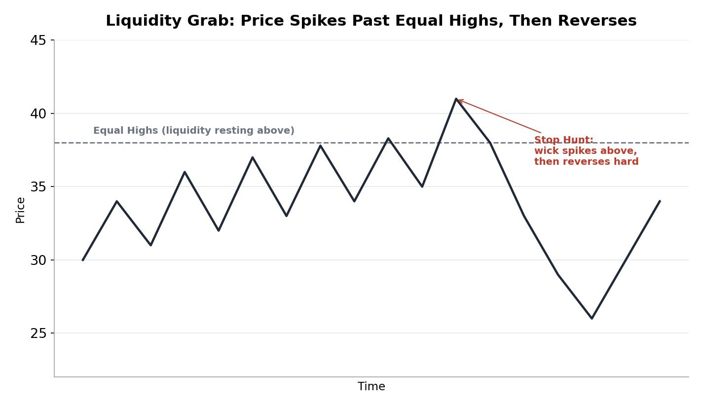
Liquidity, in this context, simply means a cluster of pending orders sitting at a price level, both stop loss orders from traders who bought below that level, and fresh sell or buy orders from traders waiting for a breakout. When price has touched the same high two or more times, as shown in the picture, many traders place their stop loss just above it, creating a pocket of resting orders right there.
A stop hunt, also called a liquidity grab, is when price pushes just far enough past that level to trigger those resting orders, before reversing back in the opposite direction. This is not some rare conspiracy, it is simply a natural result of so many traders placing their stops at the same obvious, easy to spot price.
The practical lesson is not to assume every single level will be respected cleanly on the first touch. Many experienced price action traders deliberately avoid placing their own stop loss at the exact same obvious price everyone else is using, and instead place it a little further away, with room to breathe, exactly the kind of planning Step 29 covers in detail.
Step 17: Reversal Patterns, the Head and Shoulders
A reversal pattern is a shape that tends to form right before a trend changes direction. The Head and Shoulders is one of the most famous and most recognizable ones.
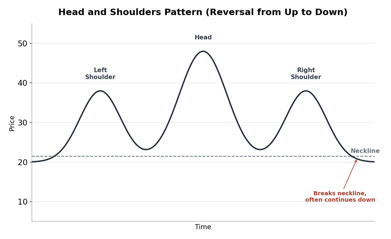
It forms after an uptrend, as three rounded peaks. The first and third peaks, called the shoulders, are roughly similar in height. The middle peak, called the head, is clearly the tallest. A line connecting the two low points between the peaks is called the neckline.
Many traders watch for price to close firmly below the neckline as the real signal, not just the shape forming by itself. A pattern that looks right but never actually breaks the neckline has not confirmed anything yet, it is still just a shape on a chart. An upside down version of this pattern, called an Inverse Head and Shoulders, works the same way but signals a reversal from a downtrend into an uptrend instead.
Step 18: Reversal Patterns, Double Top and Double Bottom
These two patterns are simpler cousins of the head and shoulders, made of only two peaks or two troughs instead of three.
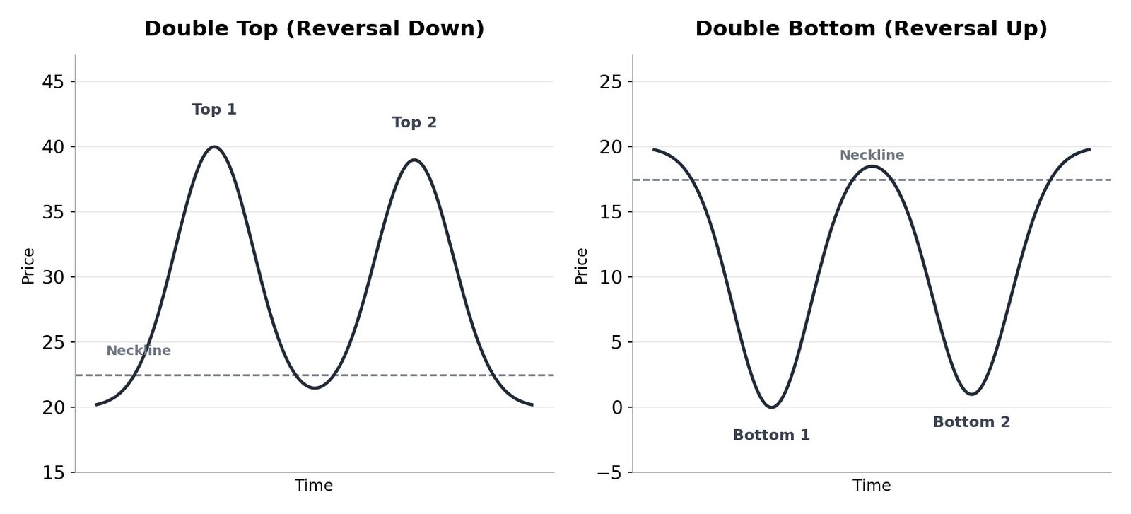
A Double Top forms after an uptrend, as two peaks at roughly the same height, with a dip in between. It can signal that buyers tried the same high twice and failed to push higher both times, often shaped like the letter M.
A Double Bottom forms after a downtrend, as two troughs at roughly the same depth, with a bounce in between. It can signal that sellers tried the same low twice and failed to push lower both times, often shaped like the letter W.
Just like the head and shoulders, most traders wait for a confirmed break of the neckline before treating either pattern as a real signal, not just a shape that happened to appear.
Step 19: Continuation Patterns, Triangles, Flags, and Wedges
Not every pattern signals a reversal. Some patterns are continuation patterns, meaning they tend to form as a short pause in the middle of an existing trend, before that same trend continues in the same direction it was already going.
- Triangle: Price makes smaller and smaller swings, squeezing between two converging trendlines, like a spring being compressed. It often ends with a sharp breakout, frequently in the same direction as the trend before it.
- Flag: A short, calm, sideways or slightly tilted pause after a sharp, strong move, shaped a bit like a small rectangle on a pole. It often continues in the same direction as the strong move that came before it, exactly the setup covered in detail in Step 20.
- Wedge: Similar to a triangle, but both trendlines tilt in the same direction, either both rising or both falling, while still squeezing together. A rising wedge inside a downtrend, or a falling wedge inside an uptrend, is sometimes treated as a reversal signal instead of a continuation one, which makes context especially important here, just as Step 8 explained.
You do not need to master drawing every one of these perfectly right away. The goal at this stage is simply to recognize the name and the rough shape when you see one, and to understand that all of them are built from the same basic ideas already covered in this course: highs, lows, support, and resistance.
Step 20: Measuring Price Targets From Patterns
Once you can recognize a pattern, a natural next question is: if this plays out, how far could price realistically go? Many price action patterns come with a simple, repeatable way to estimate a target, called a measured move.
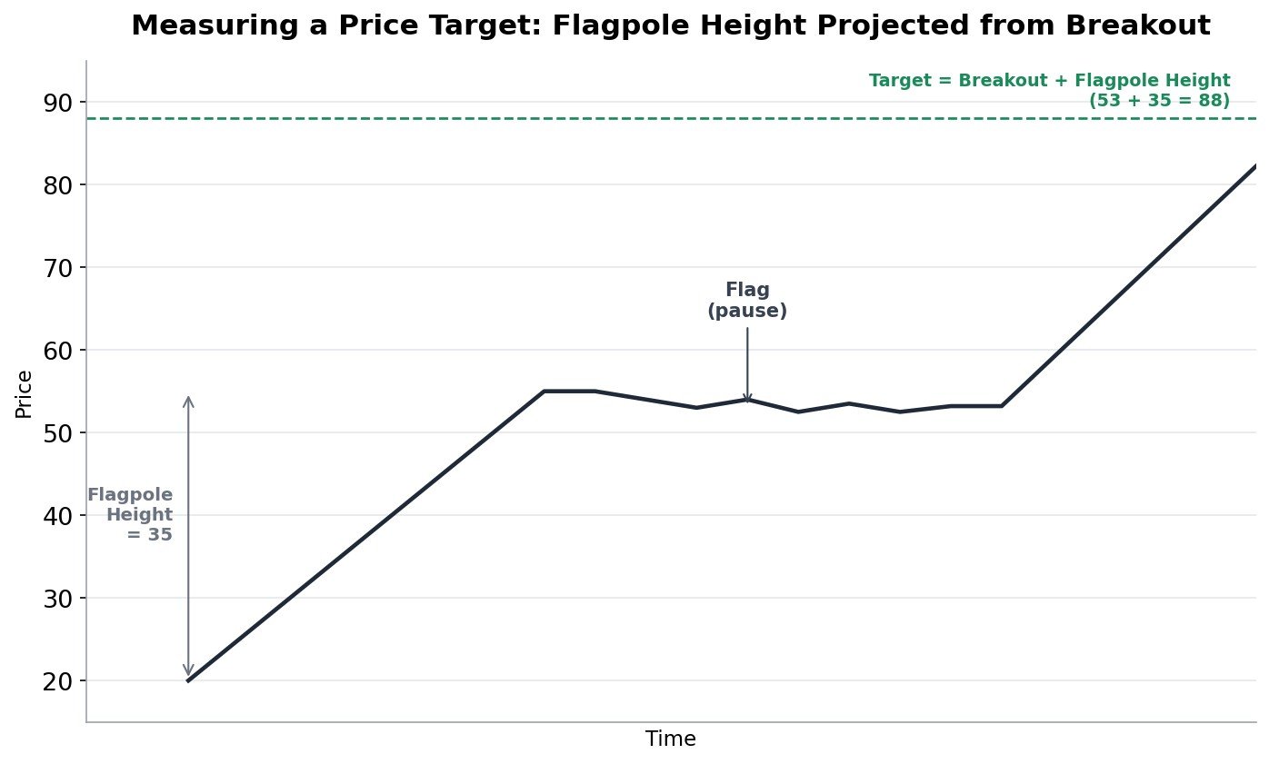
For a flag, as shown in the picture, the technique is simple. Measure the height of the sharp move before the pause, called the flagpole. Then, once price breaks out of the flag, project that exact same height upward (or downward, for a bearish flag) from the breakout point. In the example above, a flagpole height of 35 points, projected from a breakout around 53, gives a target near 88.
A similar idea applies to the head and shoulders and double top or double bottom patterns from Steps 17 and 18. You measure the vertical distance from the head (or the peaks or troughs) down to the neckline, then project that same distance from the point where the neckline actually breaks.
A measured move is a helpful planning tool, not a promise. Price often does not travel the exact projected distance, sometimes falling short, sometimes running further. Many traders use it as one input for setting a realistic first target, alongside the risk and reward thinking covered in Step 29, rather than treating it as a guaranteed destination.
Step 21: Gaps, What They Are and Why They Matter
A gap is an empty space on the chart where no trading actually happened, usually because price opened the next period sharply higher or lower than where it closed before, often because of news or an event outside market hours.
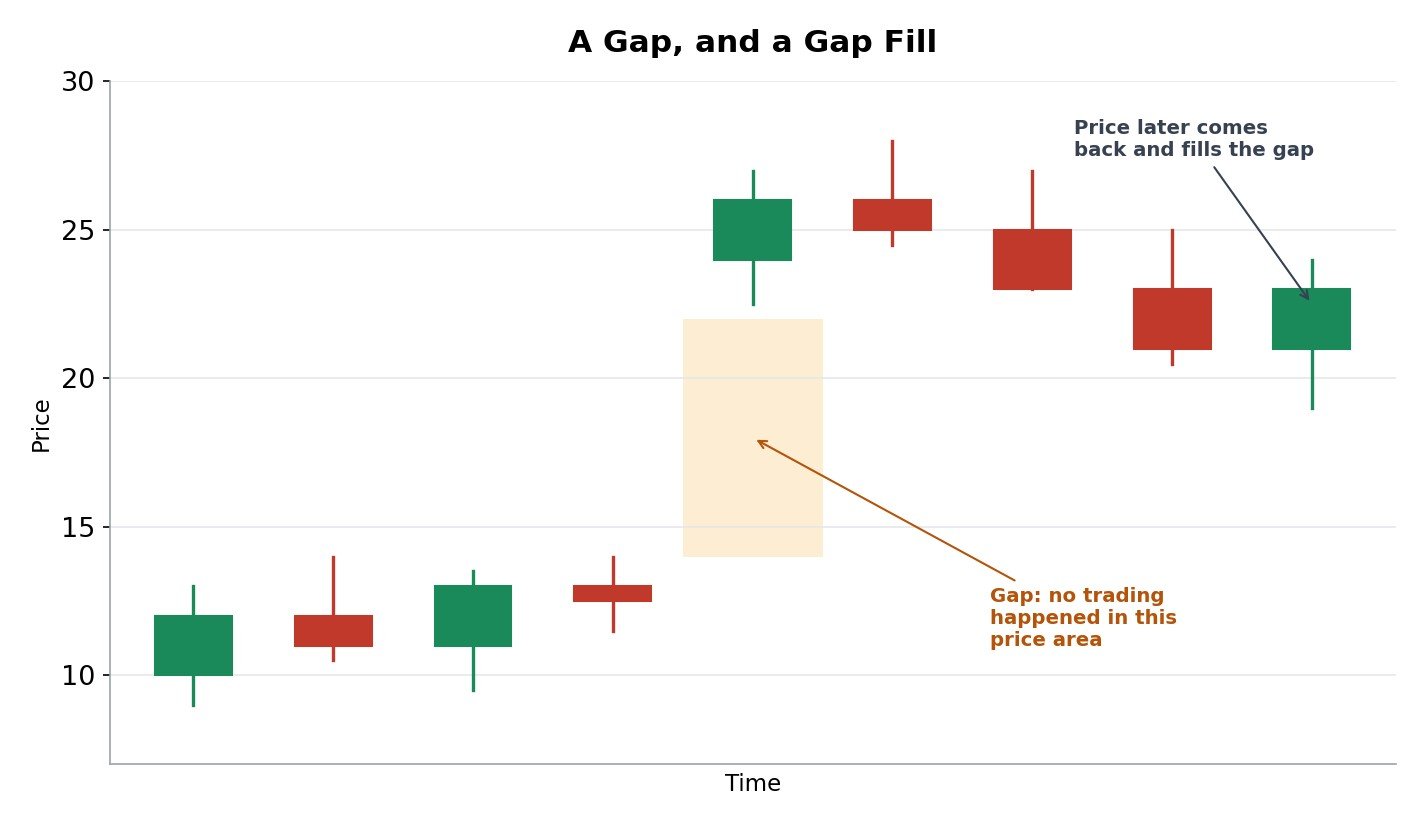
Traders generally describe a few different types of gaps, based on where they appear. A common gap happens during quiet, unremarkable price action and often fills quickly. A breakaway gap happens as price leaves an established range, often at the start of a strong new trend. A runaway gap, also called a measuring gap, happens in the middle of an already strong trend, and can sometimes be used the same way as the flagpole in Step 20. An exhaustion gap happens near the end of a long trend, often right before it reverses.
A gap fill is simply when price later moves back and trades through that empty price area again, as shown in the picture. Not every gap fills quickly, and some take a very long time. The useful habit is simply knowing a gap exists on the chart, recognizing roughly which type it might be based on where it appeared, and not being surprised if price eventually revisits it.
Step 22: Breakouts, Fakeouts, and How to Tell Them Apart
A breakout is when price moves firmly past a support or resistance level. But not every breakout is real. A fakeout, also called a false breakout, is when price pokes past the level briefly and then quickly reverses back, trapping traders who jumped in too early.
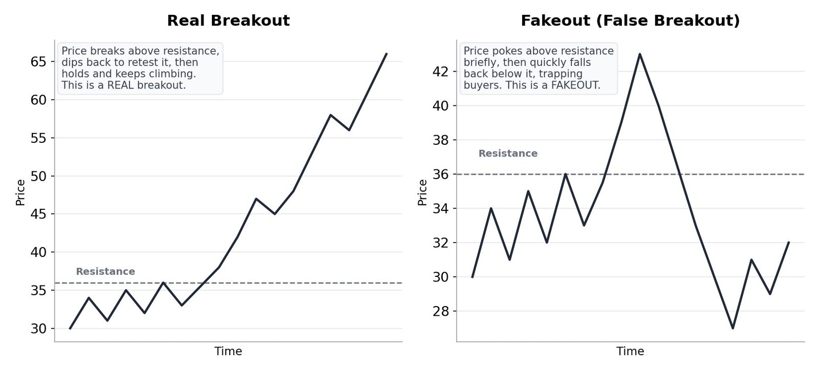
A few habits can help you tell them apart, though none of them is a perfect guarantee:
- A real breakout often comes back to gently retest the broken level and holds there, exactly like the role reversal idea from Step 9, before continuing on.
- A fakeout often shows price poking through the level on a weak move, then snapping back quickly, sometimes within the very same candle or the next one, and is often connected to the liquidity grab idea from Step 16.
- Waiting for a candle to actually close beyond the level, instead of reacting to the first touch, filters out a large number of fakeouts.
Fakeouts are a completely normal part of trading, not a sign you are doing something wrong. Even experienced traders get caught in them regularly. The goal is never to avoid every single fakeout, it is to manage your risk well enough that a fakeout costs you only a small, pre-planned amount, which Step 29 covers directly.
Step 23: Volume, the Price Action Trader’s Confirmation Tool
Volume simply means how many shares or contracts were traded during a candle’s time period. It is not technically price, but it is so closely tied to price action that most price action traders treat it as a close companion tool, not a separate indicator.
A breakout on strong, rising volume is generally considered more trustworthy than the exact same breakout on weak, quiet volume. The simple logic: a real breakout usually needs real participation, lots of traders actually buying or selling, not just a thin, quiet move that can snap back easily.
Similarly, a trend that continues while volume is fading away can be an early warning sign that the move is running out of real strength, even while price is still technically climbing or falling. Volume will not predict the future by itself, but it is one of the simplest, most direct ways to check whether a price move has real force behind it.
Step 24: Fibonacci Retracement as a Price Action Tool
Fibonacci retracement is a tool many price action traders layer on top of everything covered so far, to help estimate where a pullback inside a trend might pause or reverse, before the trend continues.
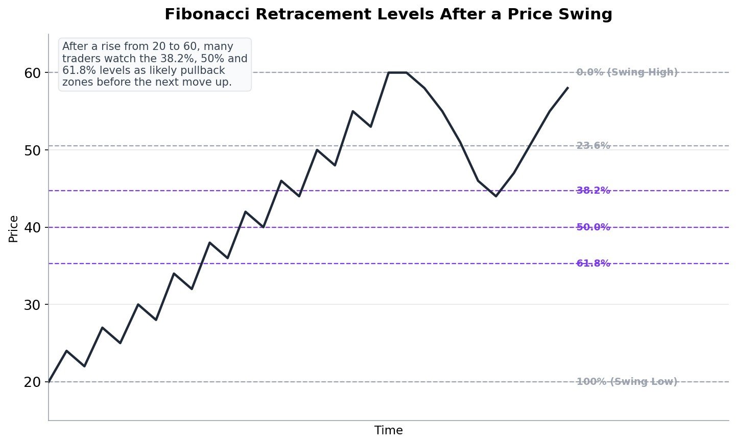
To use it, you pick a clear swing low and a clear swing high (or high and low, in a downtrend), and the tool divides that distance into a few specific percentage levels, most commonly 23.6%, 38.2%, 50%, and 61.8%. These exact percentages come from a mathematical number pattern, but you do not need to understand the math to use the tool, most charting platforms draw these levels for you automatically once you mark the swing.
Many traders watch the 38.2%, 50%, and 61.8% levels in particular, treating them as reasonable zones where a pullback inside a healthy trend might find support (in an uptrend) or resistance (in a downtrend), before the original trend resumes.
Fibonacci levels are not magic, and price does not always respect them. They work best as one extra layer of information, combined with the support, resistance, and structure ideas from earlier steps, rather than used completely on their own. A Fibonacci level that lines up with an existing support zone from Step 9 or Step 11 is generally considered far more meaningful than a Fibonacci level sitting at a random, otherwise unremarkable price.
Step 25: Using a Moving Average Alongside Price Action
A moving average is the simplest, most widely used indicator, and the one most commonly combined with pure price action rather than treated as a competitor to it, as mentioned back in Step 2.
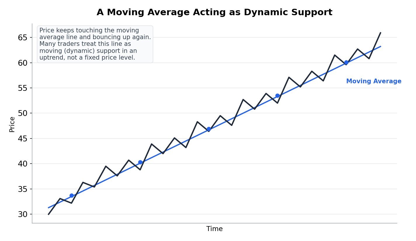
A moving average simply takes the average closing price over a set number of recent periods, for example the last 20 candles, and plots it as a smooth line that updates with each new candle. Because it is smooth, it can act like a dynamic, moving version of the support and resistance ideas from Step 9, a line that rises along with an uptrend instead of staying fixed at one price.
As shown in the picture, price in a strong uptrend often pulls back down toward the moving average repeatedly, bounces off it, and continues higher, similar in spirit to the pullback entry approach covered in Step 27. When price finally closes firmly below a moving average it had been respecting for a long time, some traders treat that as an early warning that the trend’s character may be changing.
This course does not depend on moving averages, everything else taught here works using price alone. But many price action traders do keep one or two moving averages on their chart as a simple, visual reference for the overall trend, used alongside price action rather than as a replacement for it.
Step 26: Multiple Timeframe Analysis, Zoom Out Before You Zoom In
The exact same stock can look completely different depending on which timeframe you are viewing. On a 5 minute chart, Stock A might look like it is falling sharply. On a daily chart, that same fall might just be a tiny dip inside a much bigger uptrend.
Multiple timeframe analysis simply means checking a higher timeframe first, to understand the bigger picture, before zooming into a lower timeframe to actually plan your entry. A common approach: check the daily chart for the overall trend, then the hourly chart for the current structure, then a smaller timeframe to time the entry itself.
Trading only on a very small timeframe without ever checking a bigger one is one of the most common reasons beginners feel like the market is random and choppy. It usually is not random, it is simply that a bigger, clearer trend is sitting just one timeframe above where they are looking.
Step 27: Price Action Entry Approaches
Once you can read candles, support and resistance, zones, structure, and patterns, the final piece is deciding when to actually enter a trade. Here are several widely used approaches, built entirely from ideas already covered in this course.
- Pullback Entry: In an established uptrend, wait for price to pull back down toward a prior support level, a demand zone, or the rising trendline or moving average from Steps 9, 11, and 25, then enter as it shows signs of holding and turning back up. The idea is to join the existing trend at a better price, instead of chasing it.
- Breakout Entry: Wait for price to break firmly past resistance (or support, for a downward breakout), ideally with the confirmation habits from Step 22, such as a retest holding or strong volume from Step 23, then enter in the direction of the break.
- Reversal-at-Level Entry: Wait for price to reach a well tested support or resistance level, or a demand or supply zone, then look for a reversal clue right at that level, such as a hammer at support or a shooting star at resistance from Step 6, before entering against the recent short-term move.
- Pin Bar Entry: A specific, popular version of the reversal-at-level entry, using the hammer or shooting star shape (sometimes just called a pin bar because of its long wick, or “pin”) specifically at a key support, resistance, or zone, with the stop loss placed just beyond the tip of that long wick.
- Pattern Breakout Entry: Enter once one of the patterns from Steps 17, 18, or 19 confirms, such as a neckline break, then use the measuring technique from Step 20 to help set a realistic first target.
None of these is universally “the best” one. Each fits a different kind of market condition, a pullback entry fits a trending market, a breakout entry fits a market leaving a range, and a reversal entry fits a market bouncing inside a range or a zone. Part of growing as a price action trader is learning to recognize which condition you are actually in before picking which approach to use.
Step 28: Setting Profit Targets and Managing an Open Trade
Entering a trade well is only half the job. What you do after you are in the trade matters just as much, and many beginners never think this part through in advance.
- Set a first target before you enter, not after. This might come from the nearest resistance or supply zone, a measured move from Step 20, or a simple risk to reward ratio, which Step 29 explains in full.
- Consider booking partial profit at your first target. Some traders close a portion of the position at the first realistic target and let the rest continue toward a bigger one, which reduces the emotional pressure of watching an entire position ride on one single exit decision.
- Move your stop loss to breakeven once a trade proves itself. Once price has moved comfortably in your favor, some traders move their stop loss up to their original entry price, so a reversal can no longer turn a winning trade into a loss, only into a smaller win or a scratch.
- A trailing stop follows price as it moves in your favor. Instead of one fixed target, a trailing stop can be moved along behind price, for example below each new higher low in an uptrend, letting a strong trend run further than a single fixed target might have allowed.
There is no single correct way to manage every trade. The goal of this step is simply to make sure you have decided your plan in advance, target, partial booking, and stop management, rather than deciding in the heat of the moment while money is actually on the line.
Step 29: Stop Loss and Position Sizing, With the Real Math
A stop loss is a price level where you accept you were wrong about the trade and exit, to stop a small loss from turning into a much larger one. In price action trading, the chart itself usually tells you exactly where to place it.
A simple, common rule: place your stop loss just beyond the nearest structural point that would prove your idea wrong. For a pullback buy near support, that often means just below that support level or zone. For a breakout trade, that often means just below the broken resistance level, since price slipping back under it would suggest the breakout failed.
Risk reward compares how much you are risking to how much you expect to gain. If your stop loss is Rs 2 away and your realistic target is Rs 6 away, your risk reward ratio is 1 is to 3, meaning you are risking Rs 1 to potentially make Rs 3. Many traders prefer setups where the potential reward is clearly bigger than the risk, since this means you do not need to be right on every single trade to stay profitable over time.
Position sizing is the actual math that connects your stop loss to how many shares or contracts you buy, so that a stop loss hit never costs you more than you planned. Here is a simple, worked example:
- Say you decide to risk only 1% of a Rs 1,00,000 trading account on any single trade. That is Rs 1,000 of risk.
- You want to buy Stock A at Rs 100, with your stop loss at Rs 95, based on a support zone from Step 11. Your risk per share is Rs 5 (Rs 100 minus Rs 95).
- Position size equals your total risk amount divided by your risk per share: Rs 1,000 divided by Rs 5 equals 200 shares.
- If the stop loss is hit, you lose 200 multiplied by Rs 5, which is exactly Rs 1,000, your planned 1% risk, no more.
This simple formula, risk amount divided by risk per share, is one of the most useful pieces of math in all of trading. It means your stop loss placement (based on the chart) and your position size (based on your account) are always working together, instead of you guessing a quantity and hoping the loss stays small.
Step 30: Keeping a Trading Journal and How to Practice
Reading charts is a skill, and like any skill, it improves with deliberate practice, not just time spent watching the market.
A trading journal is simply a record you keep of every trade: the setup you saw, the pattern or level involved, your entry, your stop loss, your target, and eventually the actual result. Over time, a journal lets you honestly see which setups from this course you actually understand and execute well, and which ones you consistently struggle with, instead of relying on a vague feeling or memory.
Backtesting means looking back through historical charts and marking where a specific setup, like a pin bar at support from Step 27, actually appeared in the past, to see roughly how often it played out the way you expected. This does not require predicting the future, only studying what already happened, which is freely available on any charting platform.
Paper trading, also called practice or demo trading, means placing trades with fake money on a simulator, using the exact same rules and checklist you intend to use with real money. It will never perfectly recreate the emotional pressure of real capital, but it is an honest, low cost way to build pattern recognition and confirm you actually understand a setup before risking real money on it.
Step 31: The Biggest Mistakes Beginners Make
- Trading every pattern the moment it appears. A pattern that has not been confirmed, like a neckline that has not actually broken yet, is still just a shape, not a signal.
- Ignoring the bigger timeframe. A perfect-looking setup on a small timeframe can fail simply because it is fighting against a much bigger trend one timeframe above it.
- Treating a level as one exact price instead of a zone. Expecting a perfect bounce at one precise number, instead of a reasonable area as covered in Step 10, leads to a lot of unnecessary frustration.
- Moving the stop loss further away mid-trade. This usually turns one small, planned loss into one large, unplanned one. Decide your stop loss before entering, and respect it.
- Placing the stop loss at the same obvious price as everyone else. This is exactly the pocket of liquidity described in Step 16, and it is often the first place a stop hunt reaches.
- Seeing patterns that are not really there. The human brain is very good at finding shapes in random data. Not every wiggle on a chart is a real head and shoulders or a real double top.
- Trading with no clear reason. Every trade should be able to answer a simple question: “what exactly am I seeing on this chart that makes me want to enter right now?”
- Skipping the math on position size. Entering a trade without calculating position size from Step 29 means your real risk is just a guess, not a decision.
- Expecting every single trade to work. Price action gives you a repeatable way to read the market, not a way to be right every single time. Managing losses well matters just as much as finding good setups.
Step 32: A Simple Checklist Before You Trade
Save this list, bookmark it, or share it with a friend who is learning alongside you. Go through it before every single price action trade.
- Do I know the bigger trend on a higher timeframe before looking at my entry timeframe?
- Is there a clear support, resistance, or demand or supply zone involved in this trade, not just a random spot on the chart?
- If this is a pattern, has it actually confirmed (like a neckline break), or is it still just forming?
- Do I know exactly where my stop loss goes, and why that specific point proves my idea wrong?
- Have I calculated my position size from my account risk, instead of guessing a quantity?
- Is my potential reward clearly bigger than my risk?
- Have I decided how I will manage the trade if it moves in my favor, partial profit, breakeven stop, or a trailing stop?
- Am I taking this trade from a calm, clear state of mind, not from excitement, fear, or boredom?
- Can I explain this trade in one simple sentence to a friend who knows nothing about it?
Step 33: Quick Glossary, Every Term in One Place
A fast reference for every term used across this course. Bookmark this page and jump here any time a word slips your memory.
- Candle: A picture of price movement over one fixed time period, showing open, high, low, and close.
- Body / Wick: The thick part of a candle (open to close) and the thin lines above and below it (the high and low).
- Bullish / Bearish: Expecting price to rise, or expecting price to fall.
- Support / Resistance: A price floor where buyers have stepped in before, and a price ceiling where sellers have stepped in before.
- Role Reversal: A broken resistance becoming new support, or a broken support becoming new resistance.
- Demand Zone / Supply Zone: A price area, rather than one line, that launched a strong move up or down and may matter again if revisited.
- Uptrend / Downtrend: A series of higher highs and higher lows, or a series of lower highs and lower lows.
- Trend Channel: A trend bounded by two parallel lines, acting as a moving support and a moving resistance together.
- Range: Price moving sideways between a fairly steady support and resistance.
- Liquidity: A cluster of resting orders, including stop losses, sitting at an obvious price level.
- Stop Hunt / Liquidity Grab: Price briefly pushing past a level to trigger resting orders, before reversing.
- Head and Shoulders, Double Top, Double Bottom: Chart patterns that can signal a trend is about to reverse.
- Triangle, Flag, Wedge: Chart patterns formed by converging or pausing price action, often signaling a continuation.
- Measured Move: Projecting the size of a prior move forward from a breakout point, to estimate a price target.
- Gap / Gap Fill: An empty price area where no trading happened, and price later trading back through that same area.
- Breakout / Fakeout: Price firmly moving past a level, versus briefly poking past it and quickly reversing back.
- Volume: How many shares or contracts traded during a candle’s time period.
- Fibonacci Retracement: A tool that divides a price swing into percentage levels, commonly watched as pullback zones.
- Moving Average: A smooth line showing the average closing price over a set number of recent periods.
- Timeframe: How much time a single candle represents, such as 1 minute, 1 hour, or 1 day.
- Pin Bar: A hammer or shooting star shaped candle used specifically as an entry signal at a key level.
- Stop Loss: A planned price level where you exit a trade to limit your loss.
- Risk Reward: How much you are risking compared to how much you expect to gain on a trade.
- Position Sizing: Calculating how many shares or contracts to trade, based on your account risk and your stop loss distance.
- Trading Journal: A record of every trade, kept to honestly review what is working and what is not.
- Backtesting: Studying historical charts to see how a setup has played out in the past.
- Paper Trading: Practicing with fake money on a simulator, using your real trading rules.
Step 34: What to Do Next
Reading price action is one half of the picture. The other half, the one most courses skip entirely, is the decision-making that happens once real money and real emotion are involved. Knowing exactly what a confirmed breakout looks like on paper, or how to calculate position size correctly, is very different from calmly holding your plan when the trade immediately moves against you.
That second half is what Samir Dash’s ACE framework (Aware, Control, Execute) at Mindful Trading Hub focuses on specifically, for traders who already understand the charts but still struggle to execute consistently under pressure.
Frequently Asked Questions
Is price action trading better than using indicators?
Neither is automatically better. Price action reads the raw market directly, while indicators summarize past price using a formula. Many experienced traders use price action as their main skill and add one or two simple indicators, such as a moving average from Step 25, as extra confirmation, rather than treating the two as rivals.
Do I need expensive software or special tools to learn this?
No. Any standard charting platform or broker app that shows candlestick charts is enough to practice everything in this course, including drawing Fibonacci levels and moving averages. The skill itself costs nothing to learn beyond your own time and practice.
Which timeframe should a beginner start with?
There is no single correct answer, but many beginners find it easier to start on a daily or hourly chart, where price moves more slowly and gives more time to think, before trying much faster timeframes like 1 minute or 5 minute charts.
What is the difference between support and resistance, and a demand or supply zone?
They are closely related ideas. Support and resistance, from Step 9, are usually drawn as a single line or a narrow band, based on where price has bounced before. A demand or supply zone, from Step 11, is drawn as a wider price area, specifically tied to where a strong move originally began. In practice, the two ideas overlap often, and many traders use both together.
What exactly is a stop hunt, and is it something to be afraid of?
A stop hunt, covered in Step 16, is when price briefly pushes past an obvious level to trigger the stop losses and pending orders resting there, before reversing. It is a normal, repeatable part of how markets move, not something to fear, and understanding it mainly helps you avoid placing your own stop loss at the exact same obvious price as everyone else.
How reliable is Fibonacci retracement?
It is a helpful supporting tool, not a guarantee. Fibonacci levels tend to matter most when they line up with support, resistance, or a demand or supply zone you already identified using the structure based ideas earlier in this course, rather than when used completely on their own.
How do I decide how many shares to buy?
Step 29 covers this with a worked example. The simple formula is your planned risk amount (such as 1% of your account) divided by your risk per share (the distance between your entry and your stop loss). This tells you exactly how many shares keep your loss at your planned amount if the stop loss is hit.
Can price action patterns fail?
Yes, regularly. Every pattern and level in this course is a clue about what buyers and sellers have been doing, not a guarantee of what they will do next. This is exactly why Step 29’s stop loss and position sizing ideas matter just as much as recognizing the patterns themselves.
How long does it take to get good at reading price action?
This varies a lot from person to person, and genuine skill usually takes sustained, honest practice over time, not a fixed number of days or weeks. Backtesting and paper trading, covered in Step 30, along with a trading journal, are the most reliable ways to build real comfort with these ideas over time.
Is this investment advice?
No. Samir Dash is not SEBI-registered, and nothing in this course is a stock tip, investment recommendation, or promise of returns. Every example in this course uses a hypothetical “Stock A” with made-up numbers, purely to explain how price action works. This content is for educational purposes only. Please read the Disclaimer before acting on anything you read here.
Related Reading on This Site
If you want to go deeper on specific ideas from this course, Samir Dash has written these on blog.samirdash.in:
- Price Action Trading: A Practical Guide
- Support and Resistance: How to Actually Draw Them
- Breakout Trading Strategy: How It Actually Works
- Volume Analysis: What High and Low Volume Actually Tell You
- Moving Averages: How Traders Actually Use Them
Continue Your Learning Path
You can read a chart. Now pick the market you actually want to trade it on.
- Option Trading: trade price moves with defined, limited risk.
- Forex Trading: trade currencies, the world’s most liquid market.
- Crypto Trading: trade digital assets in a market that never closes.
You can also see every course on this site, in order, and pick your own path.
Want to trade with more clarity and less emotional reactivity? Samir Dash’s ACE framework (Aware, Control, Execute) helps traders build the decision-making discipline that chart reading alone can’t teach. Learn more at Mindful Trading Hub.