

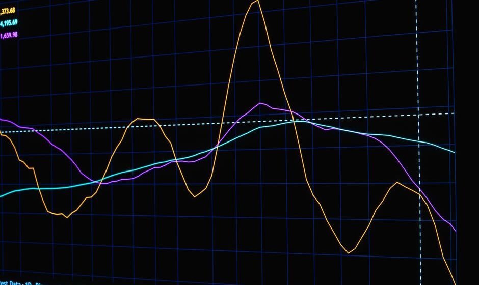

Of all the charts economists and market commentators watch closely, few get as much attention as the shape of the government bond yield curve. When that curve bends in an unusual way, called an inversion, it tends to make headlines because of its long, though imperfect, history of showing up before recessions. This article explains what a yield curve actually is, what an inversion means, and why it matters so much, in plain language.
What a Yield Curve Actually Is
A government issues bonds of many different maturities: some that pay back in a few months, some in a few years, and some in ten, twenty, or thirty years. Each of these bonds offers a yield, which is essentially the annual return an investor earns for lending money to the government for that specific length of time.
If you plot the yield of each bond against how long it takes to mature, from the shortest-term bonds on the left to the longest-term bonds on the right, you get a line called the yield curve. Under normal conditions, this curve slopes upward: longer-term bonds offer higher yields than shorter-term bonds. This makes intuitive sense. If you lend your money for thirty years instead of three months, you are taking on more risk and more uncertainty, since a lot can change over three decades, so you would reasonably expect a higher return to compensate for that risk and for tying your money up for longer.
What a Yield Curve Inversion Means
A yield curve inversion is when this normal relationship flips: shorter-term bonds start offering higher yields than longer-term bonds. This is unusual, because it means investors are accepting a lower return for locking their money up for a much longer period than they would get for a shorter-term investment, which goes against the normal risk-and-reward relationship described above.
The most commonly watched version of this in US markets compares the yield on a two-year government bond to the yield on a ten-year government bond. When the two-year yield rises above the ten-year yield, that specific part of the curve is described as “inverted,” and it tends to generate significant attention in financial media.
Why Does the Curve Invert in the First Place?
An inversion typically happens when investors expect that interest rates will need to come down in the future, usually because they expect weaker economic growth ahead. Here is the underlying logic. Short-term bond yields are heavily influenced by the central bank’s current policy rate. If the central bank has recently raised rates a lot to fight inflation, short-term yields rise to reflect that.
Long-term bond yields, on the other hand, reflect investors’ expectations for growth and inflation averaged out over many years into the future. If investors believe that today’s high interest rates will eventually slow the economy down enough that the central bank will need to cut rates again in the future, long-term yields can end up lower than today’s short-term yields, because the long-term rate reflects an average that includes those expected future cuts. This mismatch, high rates now, expected lower rates later, is what produces the inversion.
Why Investors Treat It as a Recession Warning
A yield curve inversion has, over a long historical record, preceded recessions in the United States with a fairly consistent track record, which is exactly why it gets so much attention. The logic connects back to the soft landing versus hard landing discussion: an inversion is essentially the bond market’s own vote that a central bank’s rate hikes are, or soon will be, strong enough to meaningfully slow the economy. The relationship between these outcomes is explored further in this explainer on soft landing versus hard landing.
It’s important to be precise and honest about the limitations of this signal, because it’s often oversimplified in casual commentary. An inversion has historically preceded recessions, but the amount of time between the inversion and the actual recession has varied a great deal, sometimes many months, and the signal has occasionally flagged risk without a recession immediately following in the way markets expected. It’s a useful, closely watched indicator of risk, not a precise, reliable countdown clock.
How the Yield Curve Connects to QE, QT, and Global Capital Flows
Central bank bond-buying and bond-selling programs, quantitative easing and quantitative tightening, directly influence the shape of the yield curve by changing the demand for bonds of different maturities. The mechanics of these programs, and how they connect to the yield curve, are explained in this explainer on quantitative easing and quantitative tightening.
The yield curve also matters a great deal for how attractive US bonds look to global investors relative to riskier assets elsewhere, including Indian equities. Rising US yields, particularly at the longer end of the curve, have historically coincided with periods where foreign institutional investors reduce their exposure to emerging markets like India in favor of safer, higher-yielding US bonds. This specific relationship, and why it matters to Indian portfolios, is covered in detail in this explainer on US bond yields and FII selling.
Does India Have Its Own Yield Curve to Watch?
Yes. India has its own government bond yield curve, built from bonds issued by the Government of India across different maturities, and it reflects domestic growth, inflation, and fiscal conditions rather than US conditions directly. India’s yield curve can behave quite differently from the US yield curve at any given time, since the two economies face different domestic drivers, even though global capital flows and risk sentiment create some connection between them. Watching the US yield curve is primarily useful for understanding global risk sentiment and its spillover effects on India, not as a direct substitute for watching India’s own curve.
What This Means for a Long-Term Investor
For a long-term investor, the yield curve is best treated as one input among many, a useful piece of context for understanding why markets are behaving cautiously or nervously during certain periods, rather than a trading signal to act on by itself. Given how much the lag between inversion and any actual economic slowdown has varied historically, trying to time an exit from the market purely based on a yield curve inversion has, historically, often meant giving up a significant amount of further market gains while waiting for a downturn that may take a long time to arrive, or may arrive in a milder form than feared.
How to Follow the Yield Curve Without Overreacting to It
Given how much financial media attention the yield curve gets, it’s worth developing a sensible, measured way to follow it rather than treating every headline about it as urgent news. One practical approach is to check the shape of the curve periodically, say once a month or once a quarter, rather than reacting to daily movements, since short-term noise in bond yields is common and a single day’s move rarely changes the broader picture in a meaningful way.
It also helps to look at the yield curve alongside other indicators discussed elsewhere in this macro series, rather than in isolation. A yield curve inversion that appears alongside weakening employment data and slowing consumer spending carries more weight as a warning sign than one that appears while other indicators still look healthy. Macro indicators are generally more reliable when read together as a pattern than when any single one is treated as a standalone verdict on where the economy is headed.
Finally, it is worth remembering that the yield curve is a reflection of what bond market participants currently expect, not a mechanical prediction engine. Those expectations can and do change as new information arrives, which is why the curve itself moves around over time rather than giving one fixed, permanent signal.
Frequently asked questions
Does a yield curve inversion guarantee a recession?
No. It has a strong historical track record as a warning sign, but it is not a guarantee, and the timing between an inversion and any eventual slowdown has varied significantly across different periods.
Which part of the yield curve matters most?
The comparison between two-year and ten-year US government bond yields is the most widely cited version in financial media, though economists also look at other combinations, such as very short-term yields compared to ten-year yields, for additional context.
Why do bond yields and bond prices move in opposite directions?
A bond pays a fixed amount over its life. If its price falls, that same fixed payment represents a higher percentage return, so its yield rises. If its price rises, that same fixed payment represents a lower percentage return, so its yield falls. This inverse relationship is a basic mechanical feature of how bonds work.
Can the yield curve un-invert, and what does that mean?
Yes, the curve can return to its normal upward slope, and this has historically happened both before and during the start of an economic slowdown, which is why the specific timing of un-inversion is itself debated among economists as a signal.
Should I sell my investments if the yield curve inverts?
This article is for general education only and is not investment advice. The yield curve is one macro indicator among many, and any decision about your own portfolio should involve a SEBI-registered investment adviser who understands your full situation, not a reaction to a single indicator.
Curve jab seedha nahi lagta, tab bhi apna dimaag seedha rakhna zaroori hai.
Related reading:
- Contrarian Investing Explained
- Multi-Cap vs Flexi-Cap Funds Explained
- The Petrodollar System Explained
- Austerity Economics Explained
- The Eurobond Market Explained
- Payment for Order Flow, Explained Plainly
- Stock Market Index Weighting Methods Explained
- Golden Share Explained: A Veto With Minimal Stock
- Yield Curve Control Explained: Capping Yields on Purpose
- Government Bond Yield Curve Construction Explained: How the Curve Actually Gets Built
Want to learn this from the source? I run a free live session twice a week for traders with two or more years of experience who know the setups but still cannot execute under pressure. Register for the next free session here.
I am Samir Dash, founder of Mindful Trading Hub. I work with experienced traders on live market decision-making. More about my story here.